
9 Practical tips to improve your website and increase your sales in 2022

When it comes to designing or redesigning a website, it’s easy to become obsessed with aesthetics. Does that shade of green look good? Where should the logo be: on the right or left of the screen? What about putting a giant animated GIF in the middle of the page?
It’s easy to become obsessed with aesthetics when it comes to designing or redesigning a website. Does that shade of green look right? Should the logo be on the left or right side of the screen? What if we put a giant animated GIF in the middle of the page?
However, in a world where there are more than 1.8 billion websites, you have to make sure that your website, in particular, is not just another pretty face. To do this, in addition to the design, you also have to put the usability of the website, its user experience (UX), first and foremost.
At KiGUNE we want to make things easier for you and, to give you a better starting point, we have put together a list of the fundamental guidelines we apply in our web design. Also, with the best practices and design requirements we use to launch a website.
Here are our nine tips for designing your website with usability in mind. Go for it!
1— Simplicity
First of all: we need to demystify, at least a little, the importance of web design. After all, most users don’t come to your site to evaluate how elegant it is, but to perform an action or find a specific piece of information.
Unnecessary design elements with no functional purpose will only overwhelm and make it difficult for visitors to achieve their goal. From a usability and UX point of view, simplicity in web design is your best ally. If a website has all the necessary design elements, it is very difficult to go overboard with simplicity.
Some of the elements on which you can focus your work to design with simplicity but with style are the following:
- Colours: it is best not to use too many colours. The Handbook of Computer-Human Interaction recommends using a maximum of five different colours in your design.
- Typefaces: the typefaces you choose should be very legible, so it is best not to go for anything too artistic. As for the colour of the text, again, keep it as simple as possible, and make sure it contrasts with the background colour. A common recommendation is to use a maximum of three different fonts and three different font sizes.
- Graphics: use graphic elements as long as they help the user to understand the purpose of the website, to complete a task, or to perform a specific function. In other words, don’t just add images; make sure they are relevant. One of the biggest dangers in design is images that convey the wrong message.
2— Visual hierarchy
A concept closely linked to the principle of simplicity is that of visual hierarchy. By visual hierarchy we mean arranging and organising the elements of the website in such a way that visitors naturally gravitate towards the most important elements first.
People are more likely to scan a web page quickly than to read everything it contains. Therefore, we must design our website for this quick scanning, how? By arranging its elements in a way that indicates their importance.
Nielsen Norman Group formulated a theory about the F-shaped reading pattern on the web in 2006, and it has not yet lost its relevance. The F-shaped pattern and others, such as the Z-shaped pattern, are two natural scanning patterns that can help you lead the way.
For text-heavy pages — magazines, newspapers, or pages with search results — the F-shaped pattern is best; while the Z-shaped pattern is good for pages that are not text-oriented.
Remember that when it comes to optimising usability and UX, the goal is to lead visitors to complete the action we want, but in a natural and pleasant way.
3— Navegabilidad
Navigation is the cornerstone of usability. If visitors cannot navigate a website, they are likely to abandon it.
In this sense, planning an intuitive navigation on your site is crucial to help visitors find what they are looking for. Ideally, a visitor lands on your site and doesn’t have to think long and hard about where to click next. Getting from point A to point B should be as simple as possible.
Here are some tips to optimise your site’s navigation:
- Simplify the structure of your main navigation.
- Make the navigation elements clear. Keep users from having to guess what each navigation option means.
- Include navigation in the footer of your site.
- Consider using breadcrumbs on all pages (except the home page) to help users remember their navigation path.
- Include a search bar near the top of your site so visitors can search for keywords.
- Don’t offer too many navigation options per page – keep it simple!
- Include links in the text of your page and make it clear where those links go.
- Try making a basic map of all the pages of your website arranged like a pyramid: the home page is at the top, and each page linked from the previous one forms the next layer. In most cases, it is best if the map is no more than three levels deep.
4— Consistency
A basic element for your website to be user-friendly is to maintain internal and external consistency. That is, you must use the same design patterns in all parts of the website. And not only that: you will need to maintain consistency — at the level of the terms you use, or the images — with how your competitors present themselves.
The aim is that users of your website do not wonder whether certain words, situations or actions mean the same as they do on other websites, or elsewhere on your own site. It is best to follow both external and internal conventions.
Let’s look at an example of external consistency. In the screenshot below you can see the header of different websites (IKEA, Target, Etsy and Grainger). They are all e-commerce websites that apply the same standards. In all cases there is a prominent search bar, easy access to the user account and the shopping basket.
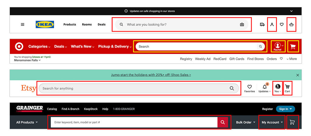
Example of external consistency. © Source: NNgroup
In terms of internal consistency, it can only be said that the overall look and feel of the site should be similar across all pages. Backgrounds, colour schemes, fonts and even the tone of the writing are all areas where consistency has a positive impact on usability and UX.
This is not to say that all pages should follow the same design, mind you. You can always create different layouts for specific types of pages — such as landing pages and informational pages — but you will need to do so consistently.
77% of users expect the simplest web design elements to behave in a certain way.
In addition, it should be emphasised that the symbols, iconography and images used should be consistent throughout the website. If you use images, you must ensure that they all receive a similar visual treatment, both in terms of colour, weight, borders and any other aspect.
5— Mobile adaptability
According to Statista, 48% of global page views come from mobile devices, both smartphones and tablets. According to HubSpot research, 93% of people have abandoned a website because it did not display correctly on their mobile device.
What does this mean? It means that we must have a mobile strategy for every website we design. To offer a really good user experience, your website or online shop must be adaptable to the different devices that your visitors use. In the world of technology, this is known as responsive design.
Responsive design means investing in a highly flexible website structure. With the ability for content to automatically resize and reorganise itself to fit the dimensions of any device. This can be achieved with mobile-friendly HTML templates, or by creating a special mobile-friendly site.
Some key guidelines to follow in this regard are as follows:
- Try a single-column layout. A single-column layout tends to work best on mobile screens, as it adapts well to different device resolutions, as well as “portrait” and “landscape” mode.
- Use the “Priority+” pattern to prioritise navigation at breakpoints. “Priority+” is a term coined by Michael Scharnagl to describe navigation that exposes the most important elements and hides the less important ones behind a “plus” button. This type of navigation makes use of the available space on the screen and, as that space increases, so does the number of navigation options on display. This leads to better visibility and greater user engagement.
- Size images appropriately for screens and platforms. To simplify this task, tools such as the Adaptive Image Breakpoint Generator can be used to generate breakpoints for images interactively.
- Check compatibility with different browsers: chances are that you have only seen your website in one browser, be it Google Chrome, Safari, Firefox or any other. Try them all.
6— Accessibility
Accessibility is another essential guideline of website design. Any current website or shop must be accessible to everyone, regardless of a person’s capabilities.
The purpose of web accessibility is to make a website that anyone can use, including people with disabilities or limitations that affect their browsing experience. As web designers, our job is to take these users into account in our UX plan.
Accessibility applies to your entire website: structure, page layout, visual elements, and written and visual content. The Web Content Accessibility Guidelines (WCAG), developed by the Web Accessibility Initiative and the World Wide Web Consortium, set out the guidelines for web accessibility.
In a broad sense, these guidelines state that websites should be:
- Perceivable: Visitors are aware of the content of your website.
- Operable: The functionality of your website should be possible in a variety of ways.
- Understandable: All content and alerts are easily understandable.
- Robust: Your website is usable on different assistive technologies, devices and browsers.
In this sense, there are many websites that use low contrast for texts. This is a mistake. Although grey text on a white background may look attractive, it is also illegible and inaccessible. Low contrast is especially problematic for users with low vision and those with contrast sensitivity problems. In the end, the most important feature of text and other vital elements of a website is readability. And we are failing to deliver.
You can use WebAIM’s contrast checker tool to quickly find out if your website is within the optimal allowable range.
7— Conventionality
A big challenge in web design today is balancing originality with expectations. Today, there are many specific conventions to which we have become accustomed over time.
Among these most widely accepted conventions we can find:
- Place the main navigation at the top (or left) of a page.
- Place a logo at the top left (or centre) of a page.
- Make the logo clickable, so that the visitor always returns to the home page.
- Have links and buttons that change colour/appearance on mouse-over.
- Use a shopping cart icon on an e-commerce site. The icon also has a numeric badge indicating the number of items in the cart.
- Include buttons on image carousels to allow users to move from one device to another, manually.
And yes, iconoclasm, revolution, always seems a good idea in art, but in web design it can be a mistake. Remember that our aim is to make the person who enters the website feel comfortable, as if they were at home, as if they had been visiting that website all their lives. And if you want to give wings to your creativity, don’t worry: there is still plenty of room for it within the limitations of web conventionality.
Take, for example, a field related to web design: architecture. In this area of creativity, building standards are set so that people can inhabit built spaces easily and safely. An architect does not complain or violate these building standards because, legal repercussions aside, they ensure the safety and comfort of the inhabitants of a building.
So no matter how dazzling the building looks, if you stumble on uneven stairs or can’t get out in case of fire, you may prefer to stay outside.
Basically, the same is true for the design of a website or shop. To create a memorable experience, you need to meet your users’ expectations. If you don’t, they may start to feel uncomfortable or even frustrated with your website.
8— Credibility
There is one thing you will need to convert more visitors into leads on your website: credibility. Credibility shows customers that you are a confident and trustworthy person. It is impossible to generate more leads, sell more products or attract more visitors without it.
One of the best ways to improve the credibility of your website is to be clear and honest about the products or services you sell. Don’t force visitors to search dozens of pages to find out what you do. You should be honest on your home page, dedicating space to explaining the value of what you do.
For example, a good way to show credibility from the start is to include a pricing page, which also links to the home page of the website.
This way, you will not force the user to contact you to find out more about your prices or rates, and your company will appear more trustworthy and legitimate.
It is a reality that most visitors abandon websites in 15 seconds or less. Only websites with an effective, honest and clear value proposition can keep the attention of their visitors for longer. Respecting web conventions also lends credibility to your website or shop. And it can increase the level of trust it conveys in the process.
9— User-centred design
At the end of the day, just as simplicity was the first and most important step, here we go with the last and no less important one: always remember that the design of a website should always be focused on the user, not on your tastes, preferences or needs.
So while the principles detailed in this list are a good place to start, the ultimate key to improving your website design is to test with your users, gather feedback and implement changes based on what you learn.
And no, don’t go to too much trouble to test usability yourself. You’ve invested so much time in your web design that your own biases enter the equation. You’ve lost perspective. Optimally, get testers who have never seen your website design before, just like any first-time visitor to your website.
Here are a few user testing tools to get you started:
- HotJar: As its name suggests, HotJar provides heat maps for web-based interfaces. In particular, its free plan allows you to collect a limited number of screen recordings, which is very useful for usability testing, although if you use the tool for multiple research sprints, you may want to purchase the premium version. It can also be integrated with Google Analytics.
- UserTesting: It is one of the most popular platforms among usability testing tools. You can quickly get feedback from real users in the form of video or notes. In our case, we prefer to work with videos or participate in live conversations, as it allows us to observe users’ facial expressions, analyse intonation and see their reactions live..
- Crazy Egg: Track multiple domains in a single account and discover insights into your website’s performance using four different intelligence tools: heat map, scroll map, overlay and confetti..
- Loop11: Use this tool to easily create usability tests, even if you have no HTML experience..
For more useful options, see the following list of the best user testing tools.
Conclusion
We hope you find these guidelines useful when designing or redesigning your website or online shop. But how do you put them into practice? To help you, check out the practical recommendations and basic design elements for a successful website.
Successful website design has to be user-centric and user-focused, so start caring more about your target audience! Imagine yourself in the shoes (or, more precisely, in the browser windows) of your visitors and keep them in mind at every step of the web design process.
According to Amazon, 88% of website visitors are less likely to return to a website after a bad experience. And how can you blame them? I’m sure we’ve all been there.